
Megan Whelen
2026

Yuna

An AI wellness coach app. I redesigned onboarding so new users start talking to the coach right away.

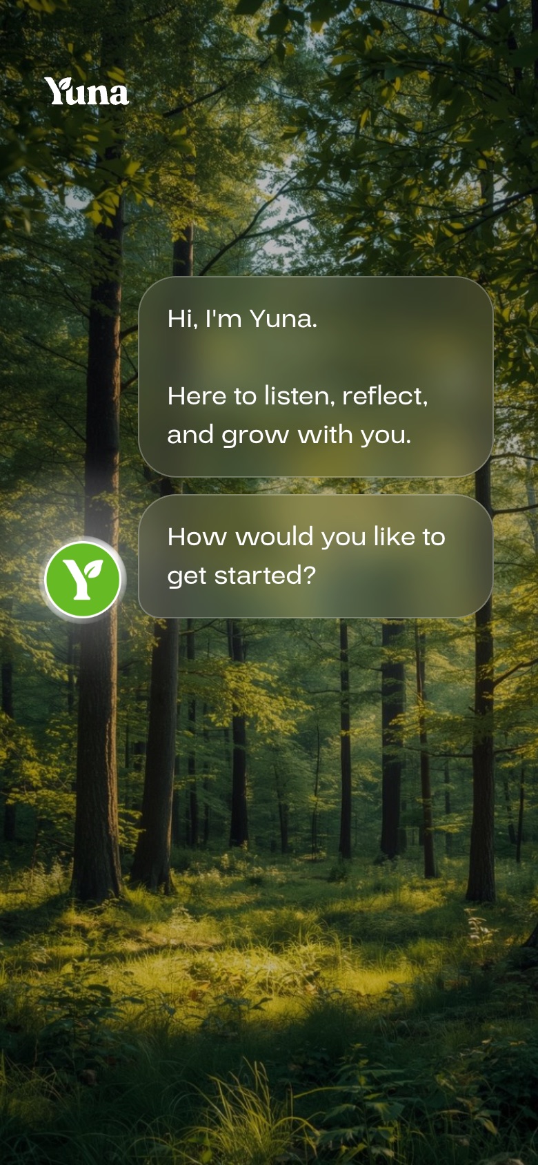
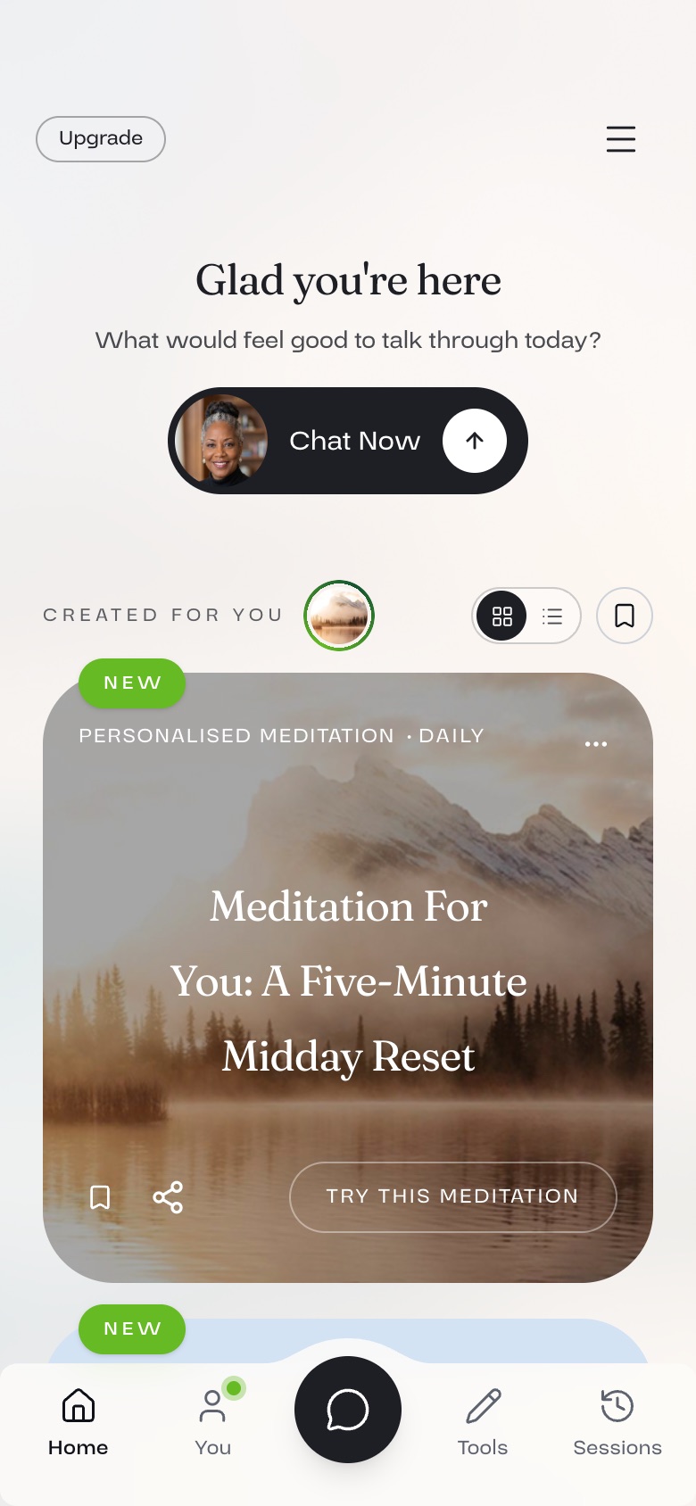
Yuna welcome screen on a forest photoYuna asks what to call youA chat with YunaHome screen in light mode

The problem

Onboarding read like a sales pitch, and every part of the app looked different. In a mental health app, that erodes trust.

What I did

Turned onboarding into a first chat with the coach, and brought every screen under one design system.

Result

+59%

more new Android users sent a first message, in an A/B test. +40% on iOS.

01

Five parts of the app, five different looks.

Onboarding, account creation, home and sessions each used their own colours, fonts and buttons.

For someone deciding whether to open up to an app, that inconsistency reads as unreliable.
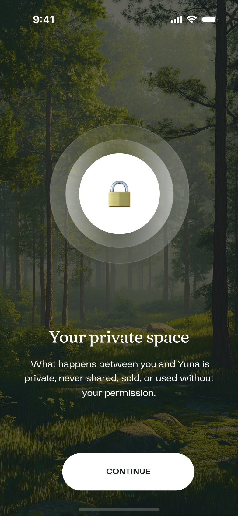
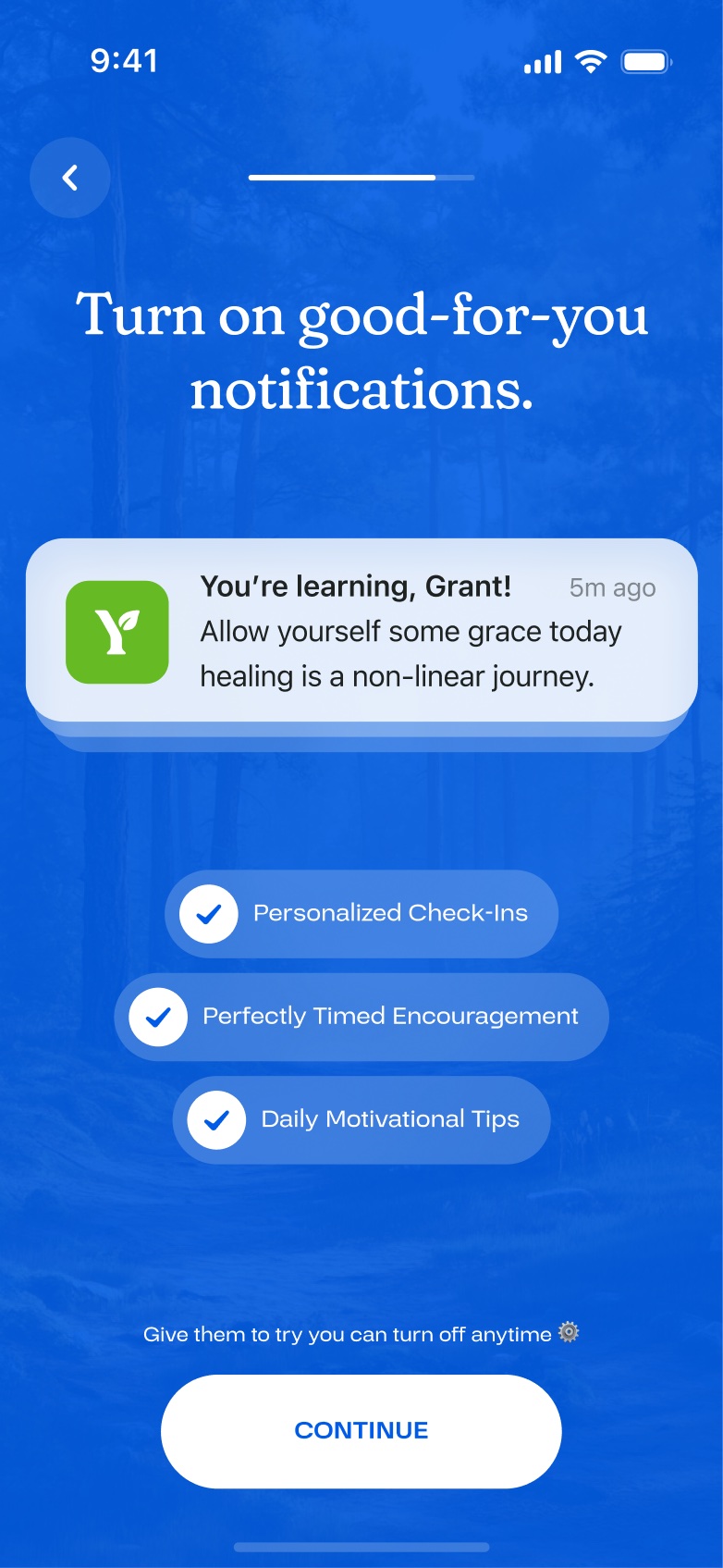
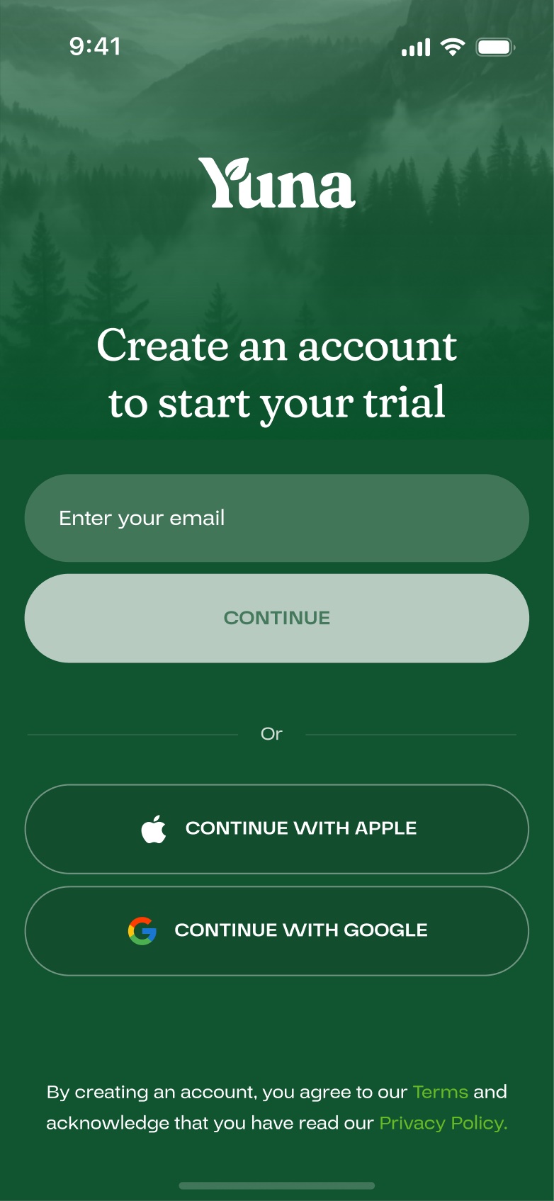
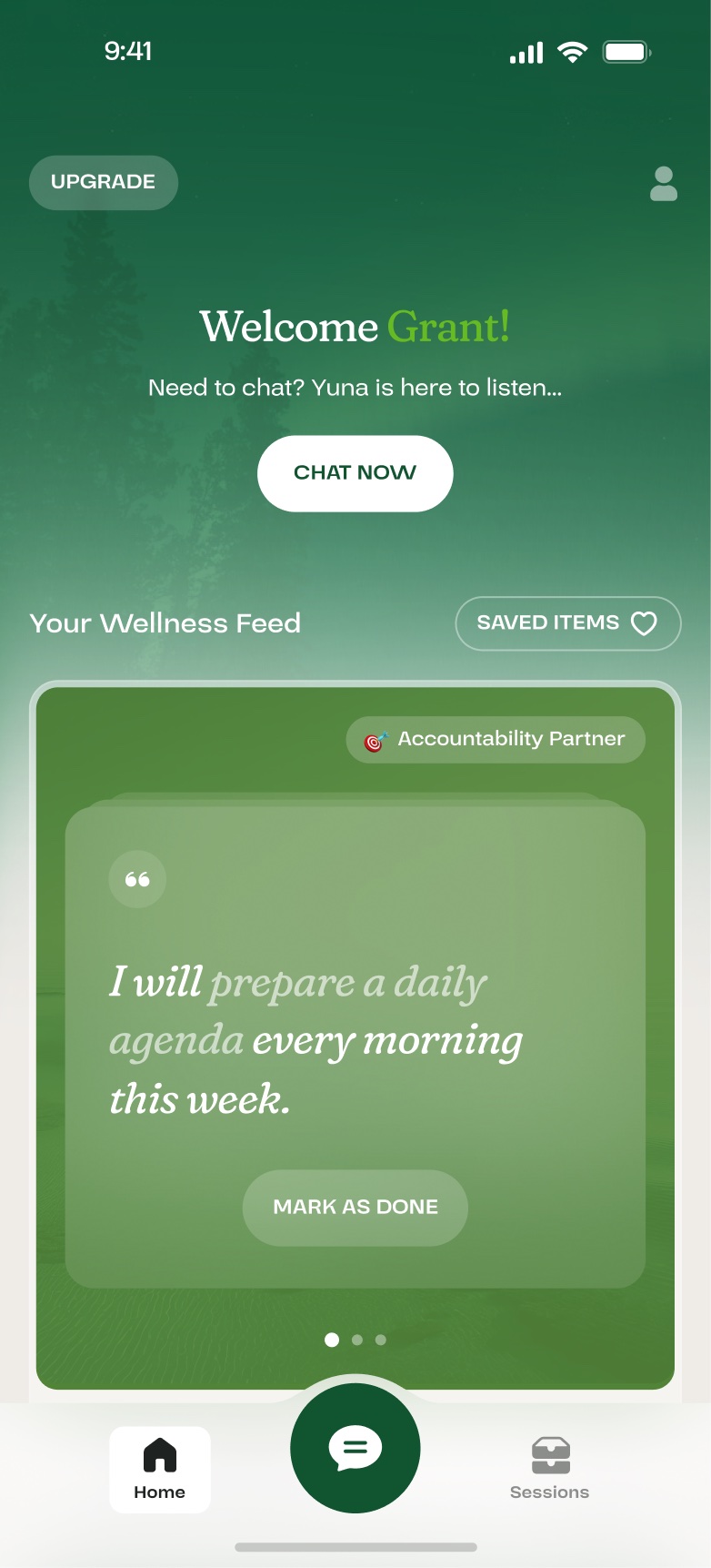
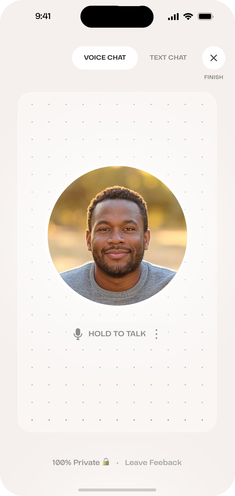
Old privacy screen: lock icon on a dark forest photoOld notifications request on a blue backgroundOld account creation screen in greenOld home screen with a wellness feed of cardsOld voice chat screen with a photo avatar
Before: privacy, notifications, sign-up, home and chat, each in its own style.

02

Onboarding became the first conversation.

The old flow listed credentials, star ratings and permission requests.

Now the coach introduces herself, asks your name and explains privacy in her own voice. New users send their first message before onboarding ends, and that first message is what we measured.
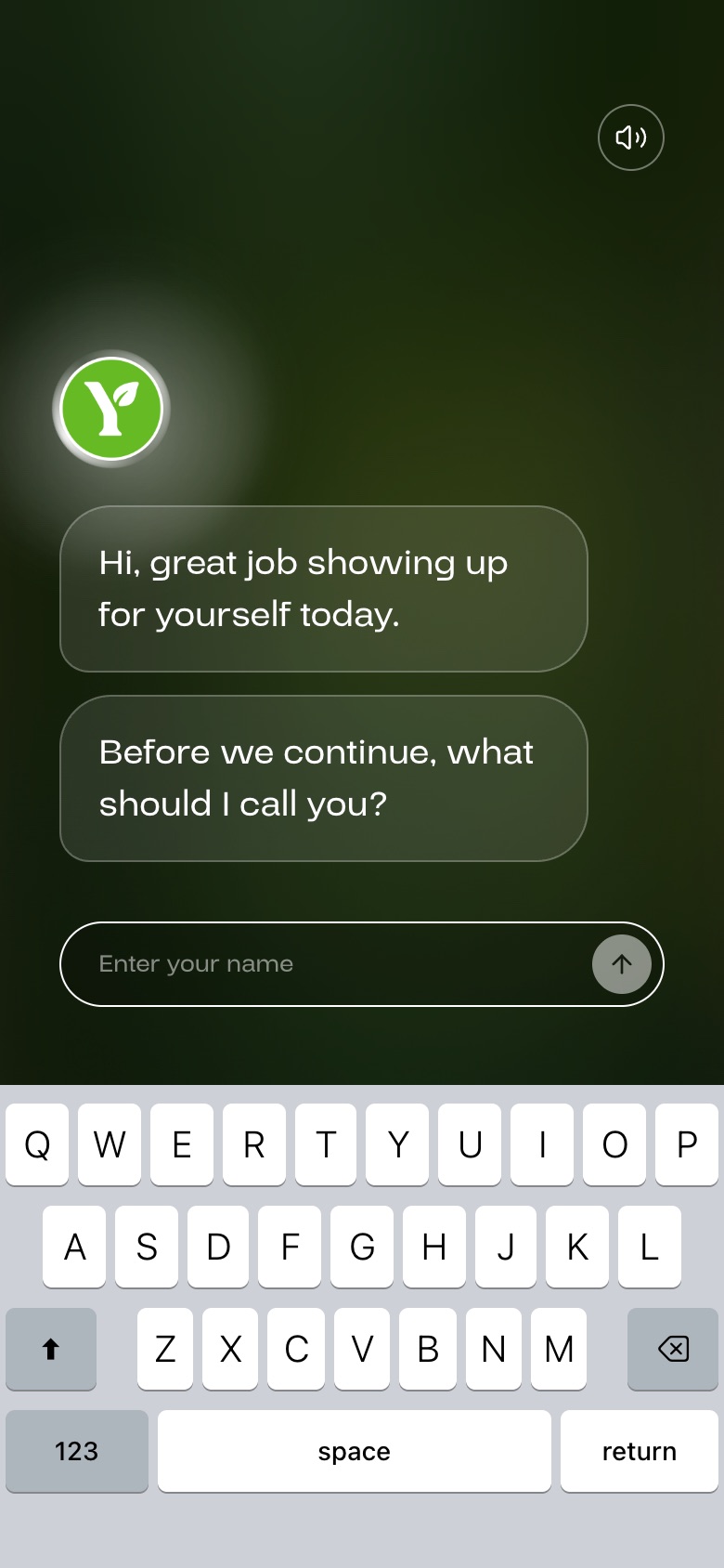
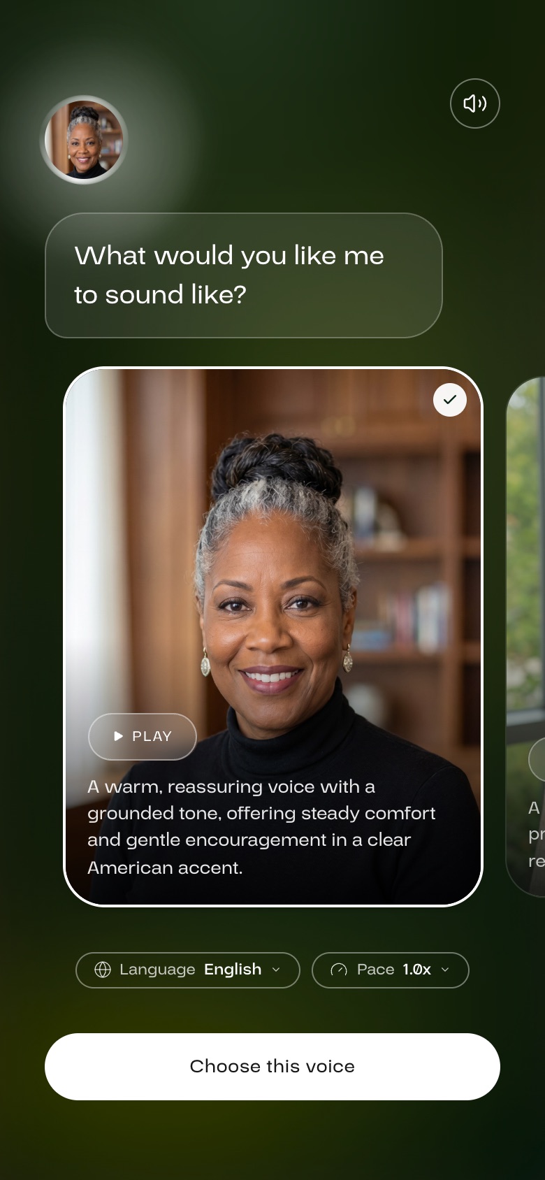
Onboarding: what should I call youChoosing Yuna's voice
After: onboarding is the first conversation.

03

One design system, light and dark.

I designed each component once and built light mode from the same colour rules, so the two themes never drift apart.

Text has a minimum contrast on photo backgrounds, enforced in code, so it stays readable on every screen.
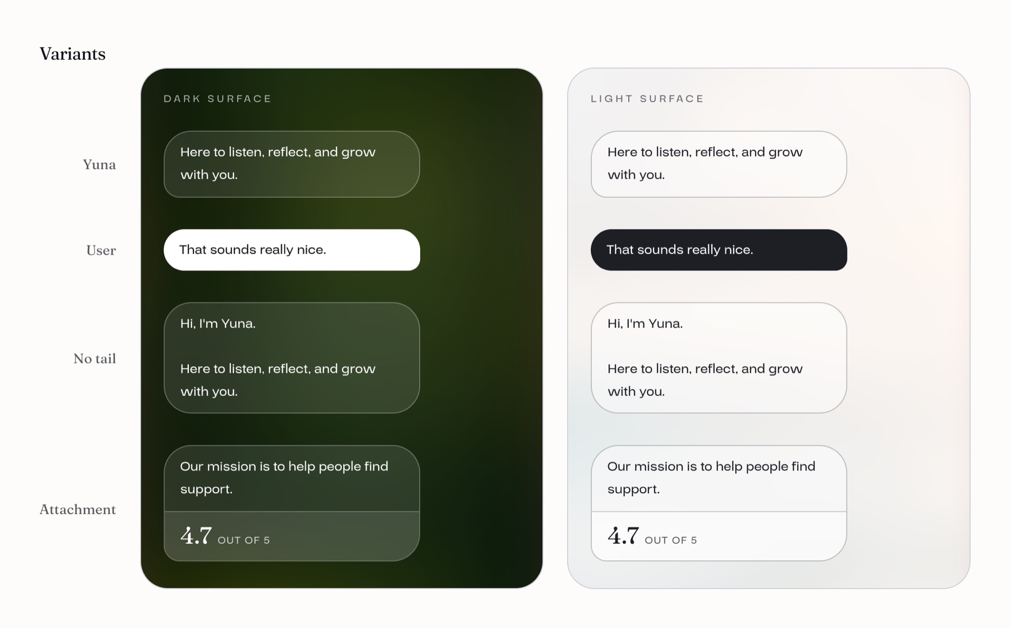
Chat bubble component on dark and light surfaces
Chat bubbles, dark and light.
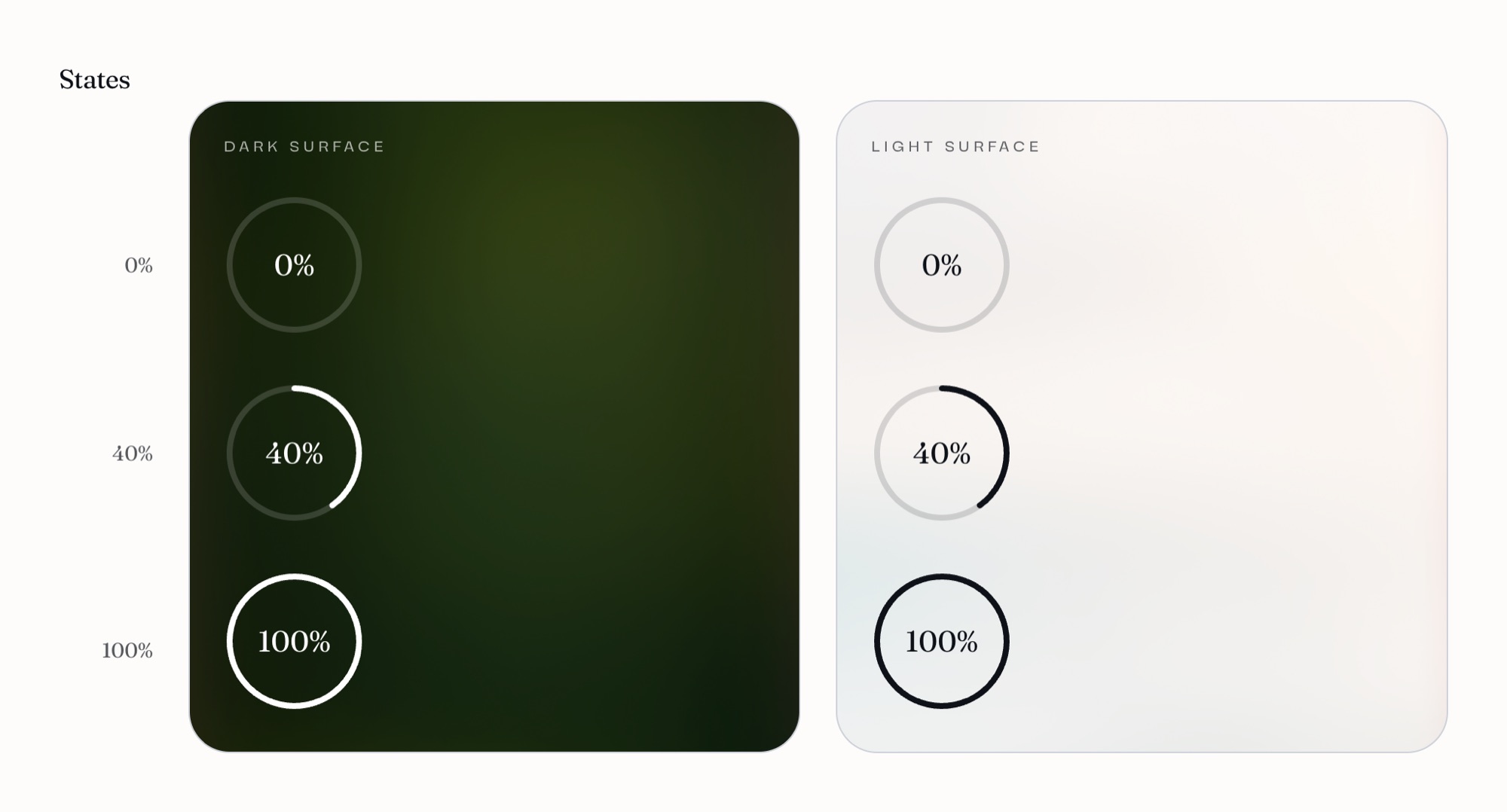
Radial progress component on dark and light
Progress ring, dark and light.

Core colours

Forest
#115430
Leaf
#66BA24
Paper
#F5F0ED
Ink
#1E2220
Alert
#F2994A

Motion

Every animation shares one timing curve. Old content leaves quickly and new content arrives a beat later, so the whole app moves the same way.
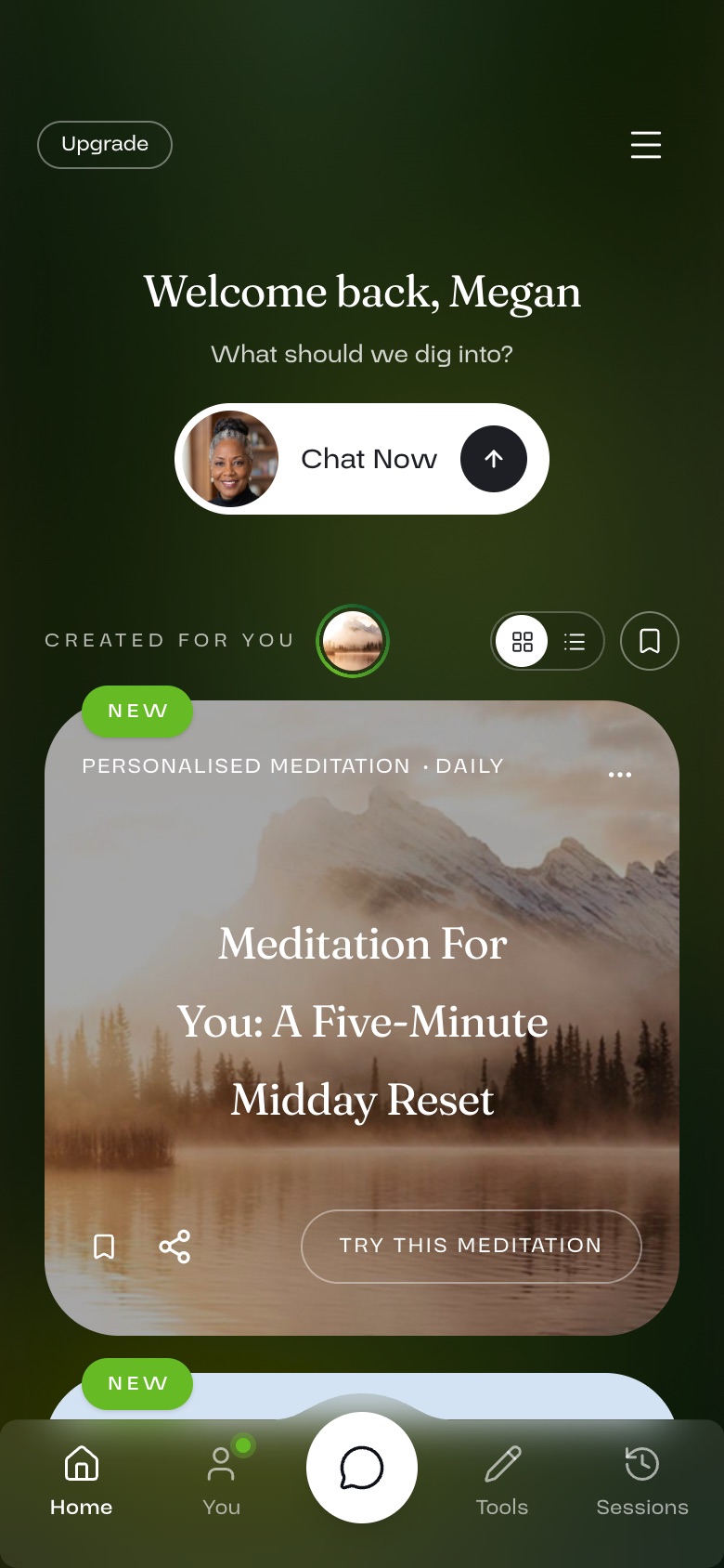
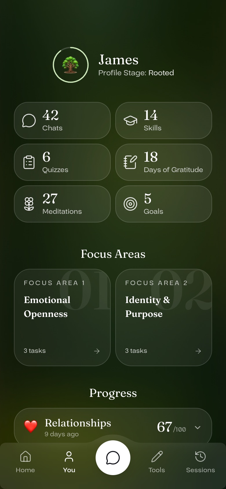
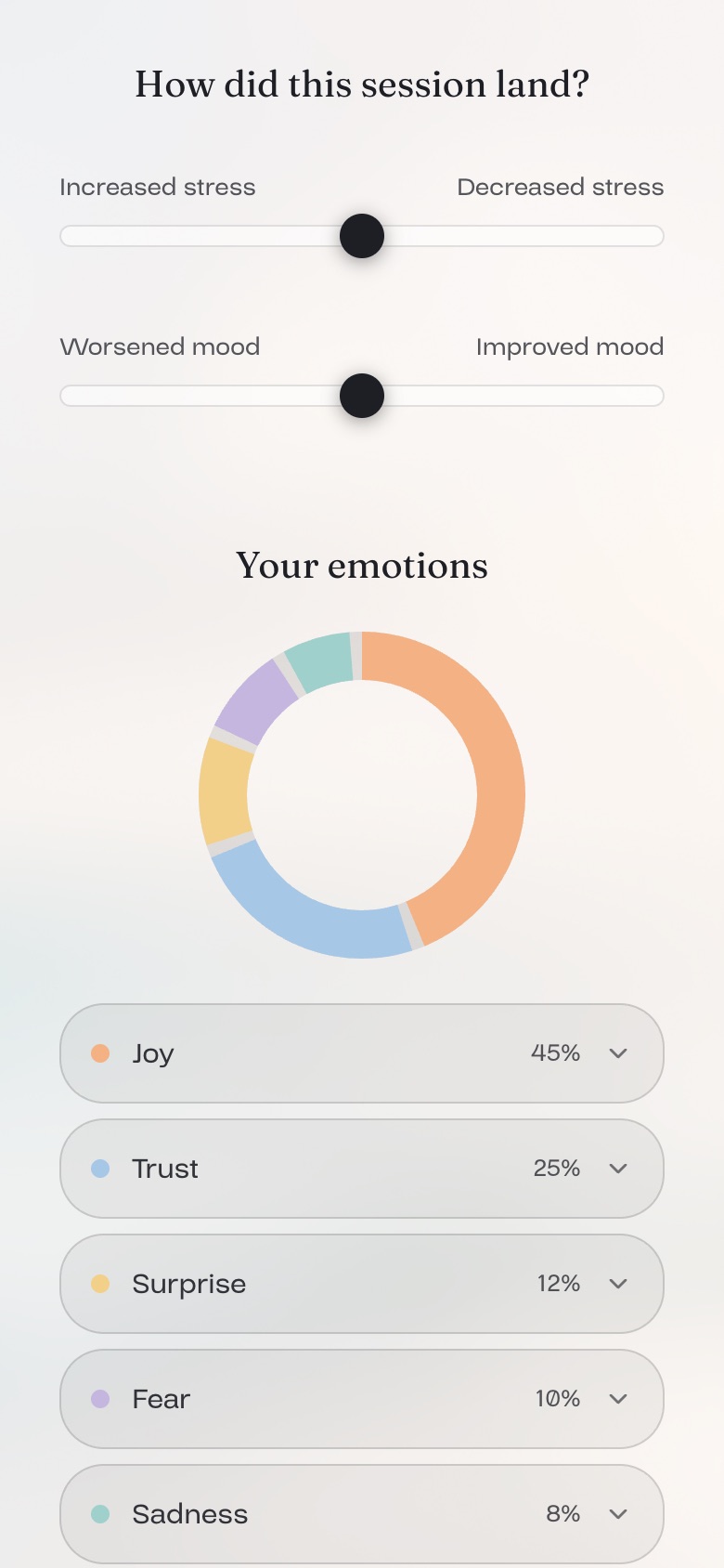
Home, darkProgress, darkProgress, lightSession wrap-up with emotion chart, light
The same components on every screen, in both themes.

Inside the app

Screens from the working prototype, as a returning user sees them.
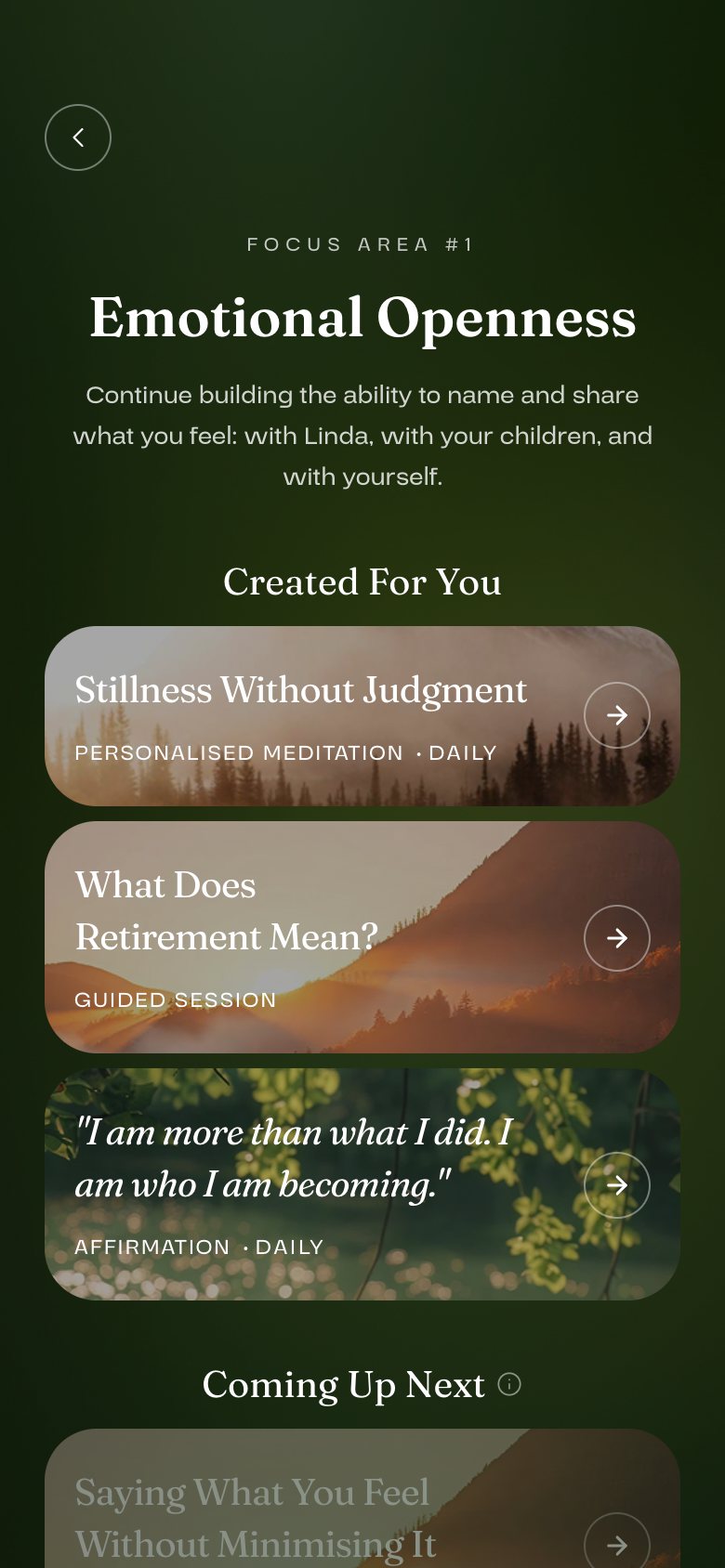
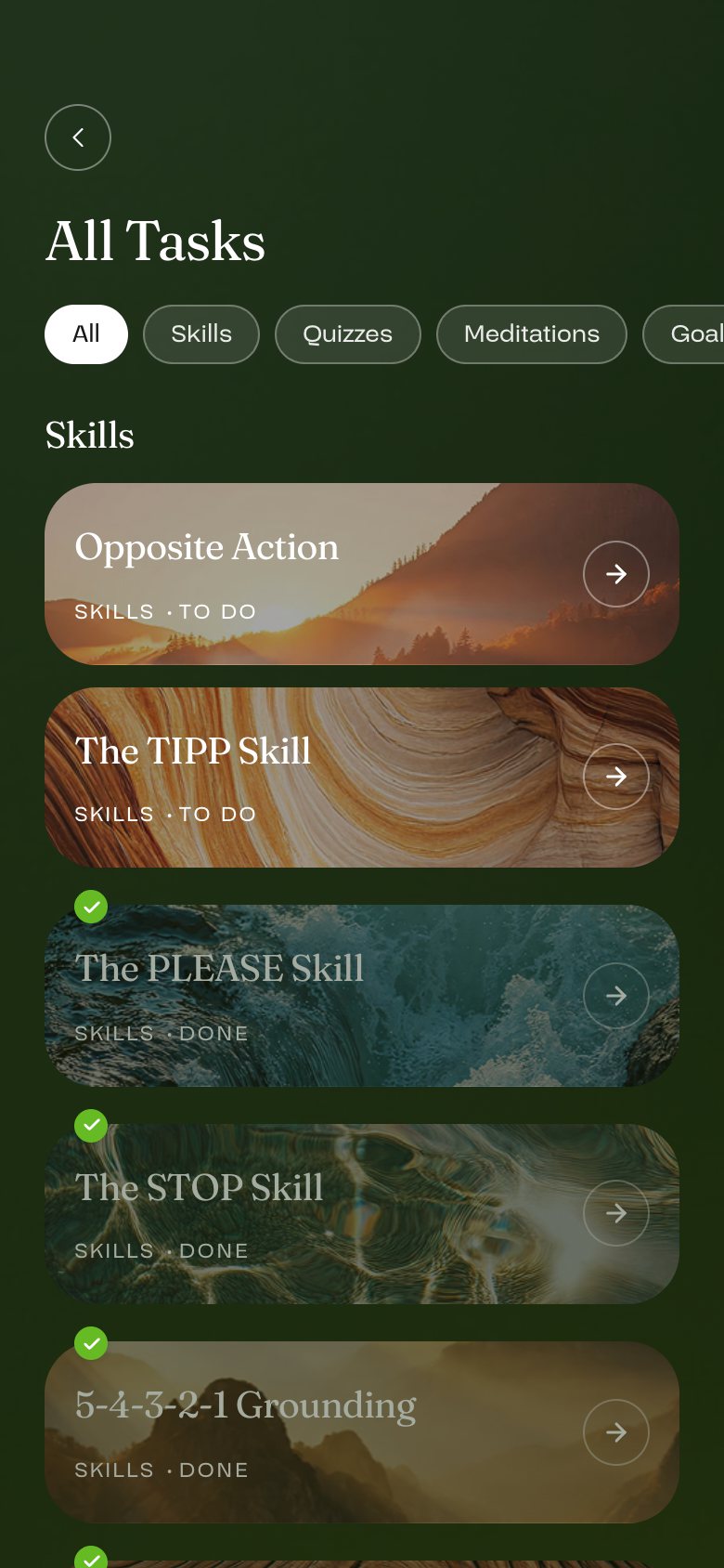
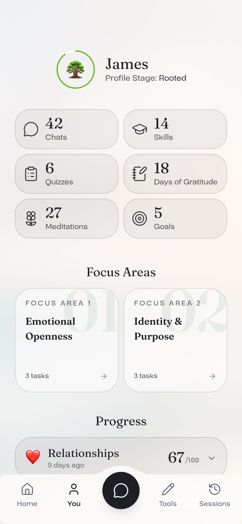
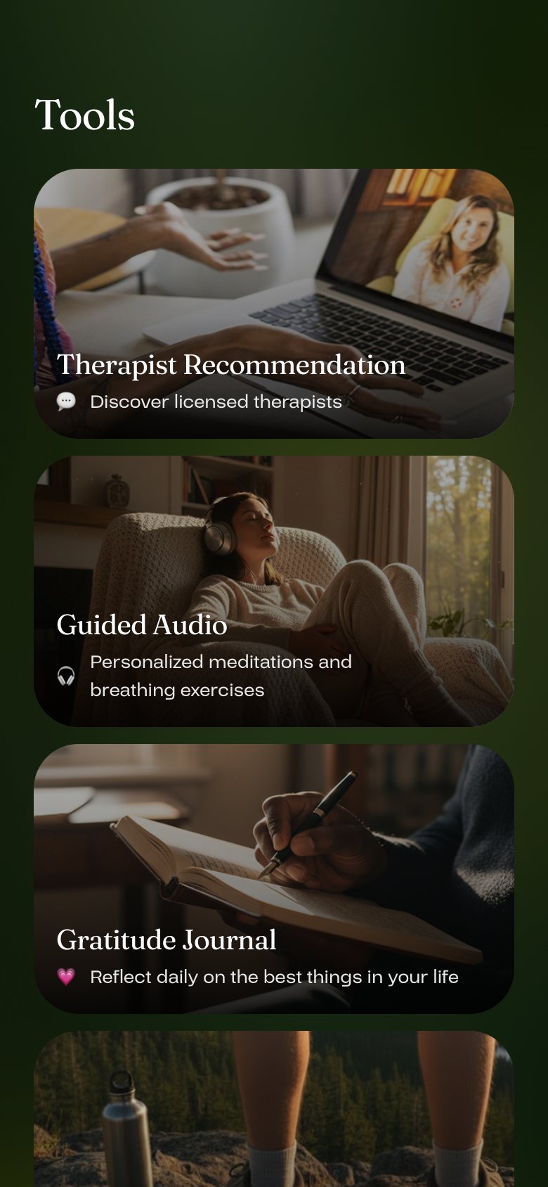
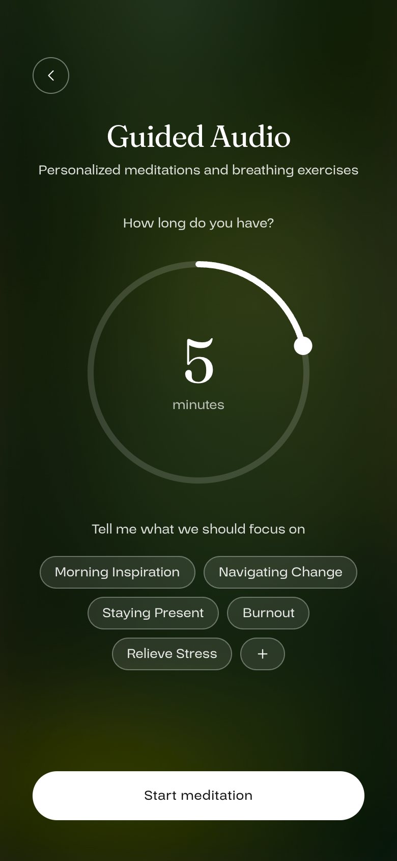
Focus area: personalised meditations, guided sessions and affirmationsAll tasks: skills to practise, with progressTools: therapist matching, guided audio, gratitude journalCreating a guided meditation
Daily practice: focus areas, skills, tools and guided audio.
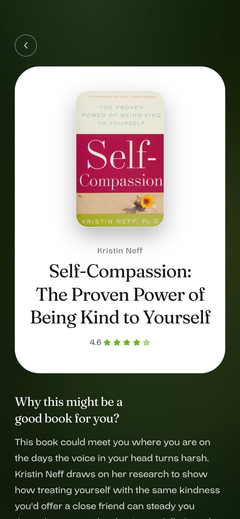
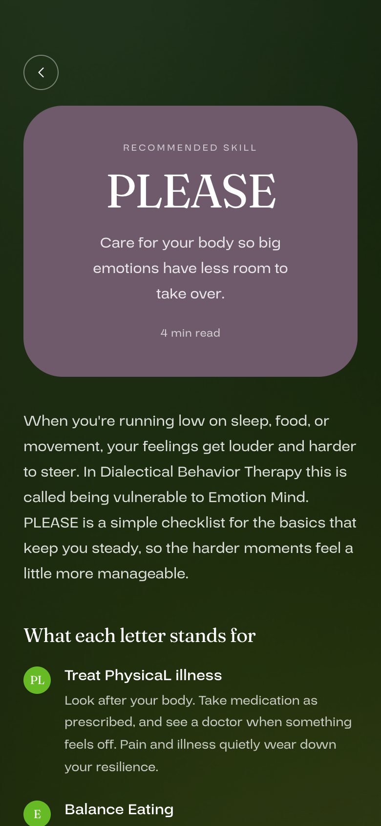
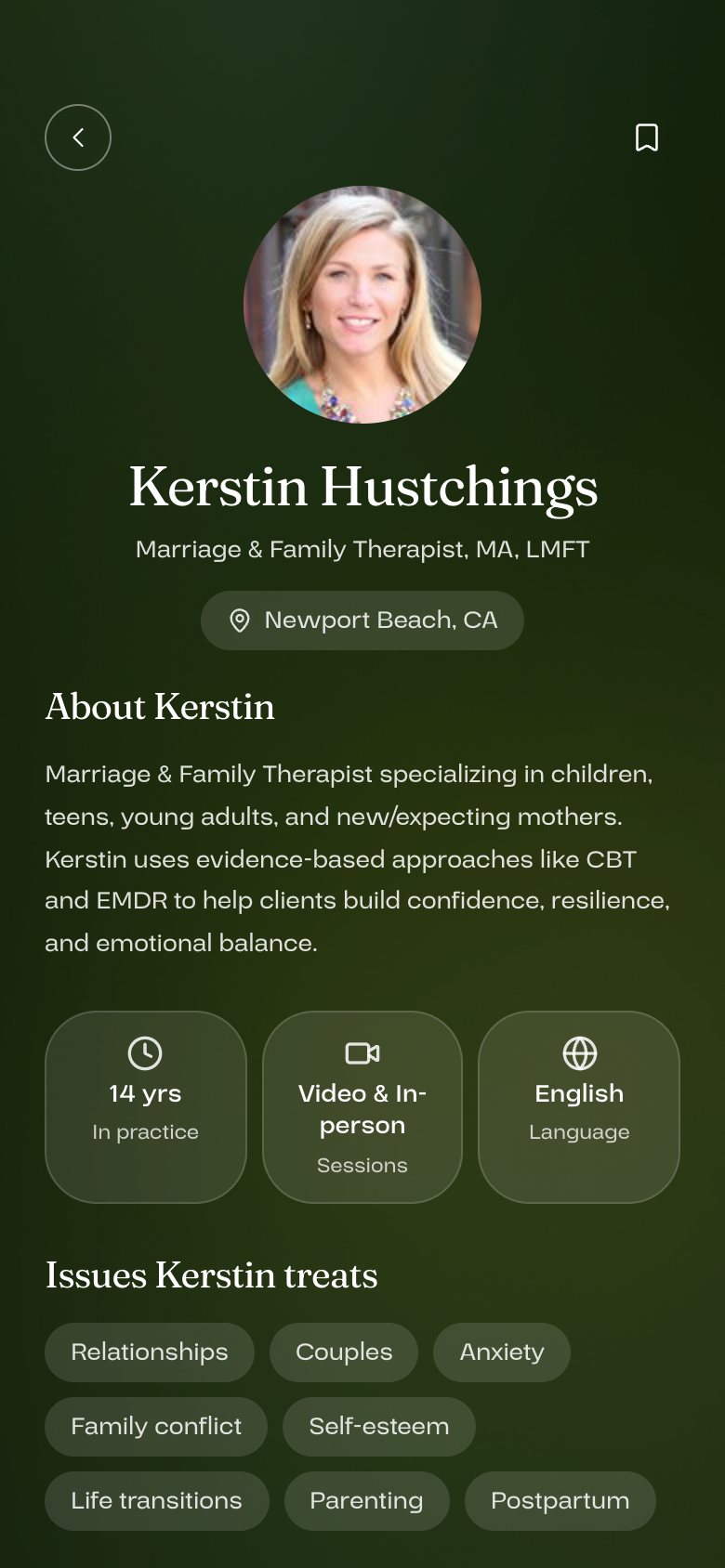
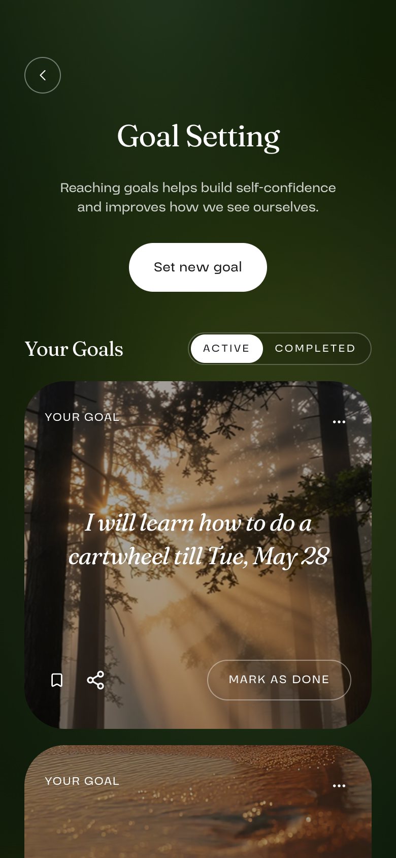
A book recommendation, with why it fitsA coping skill articleA recommended therapist's profileGoal setting, with a goal in the user's own words
Support: reading, coping skills, therapist matching and goals.
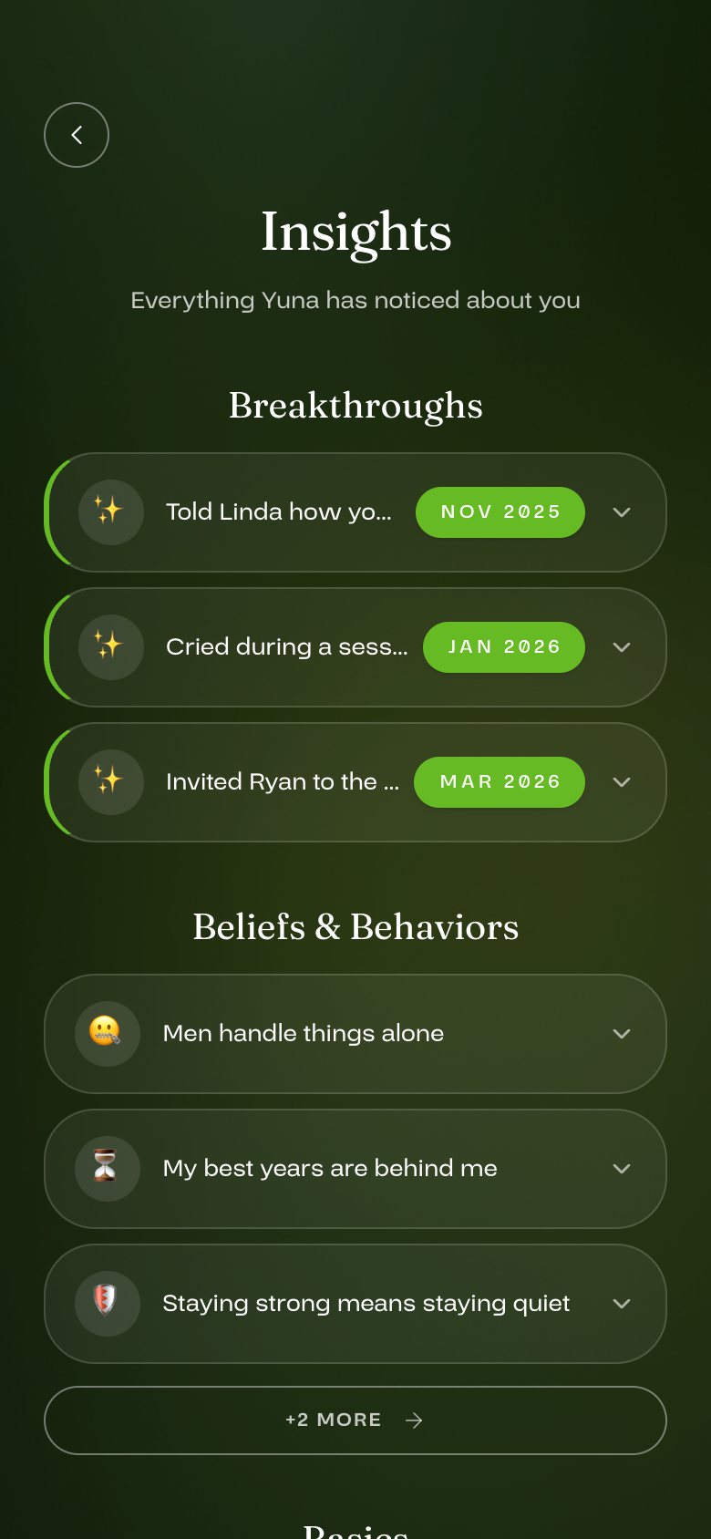
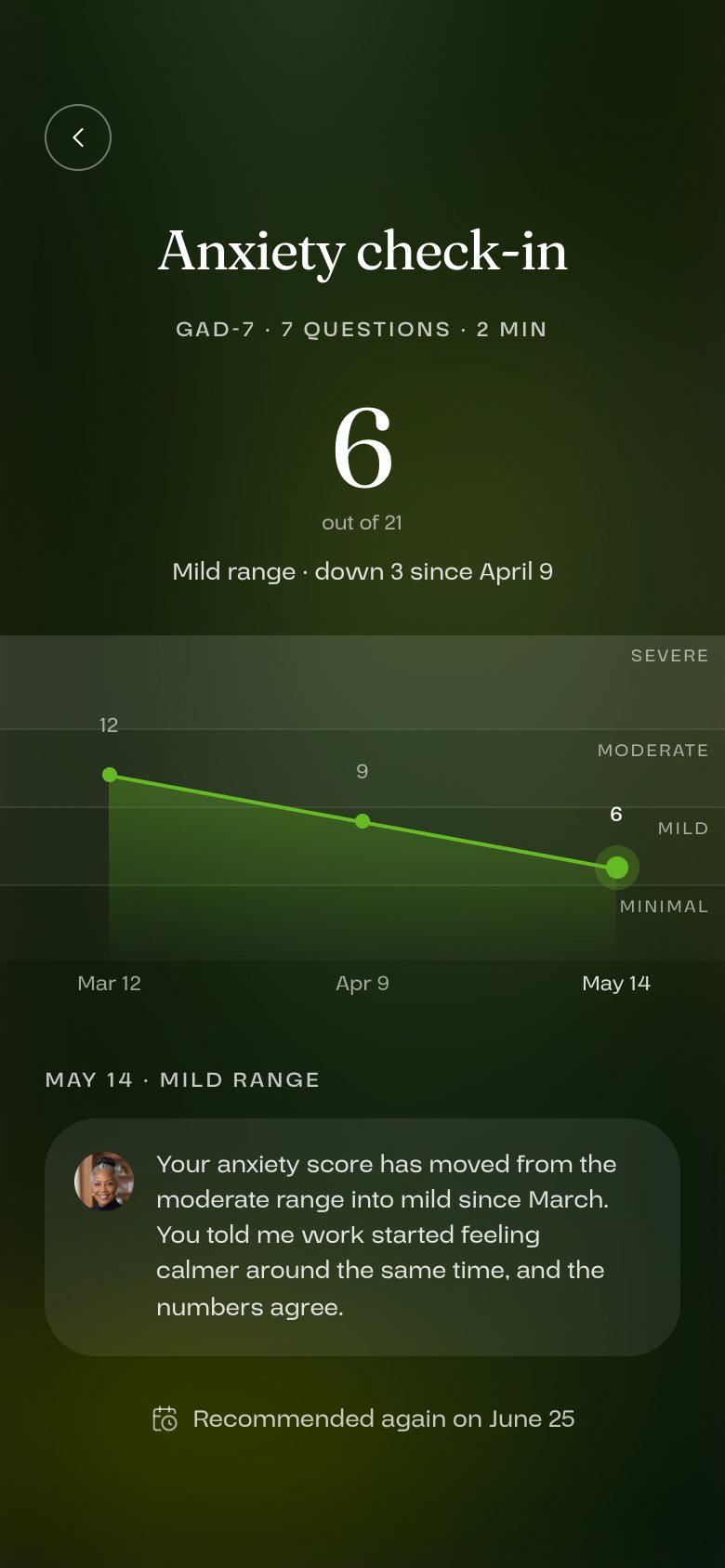
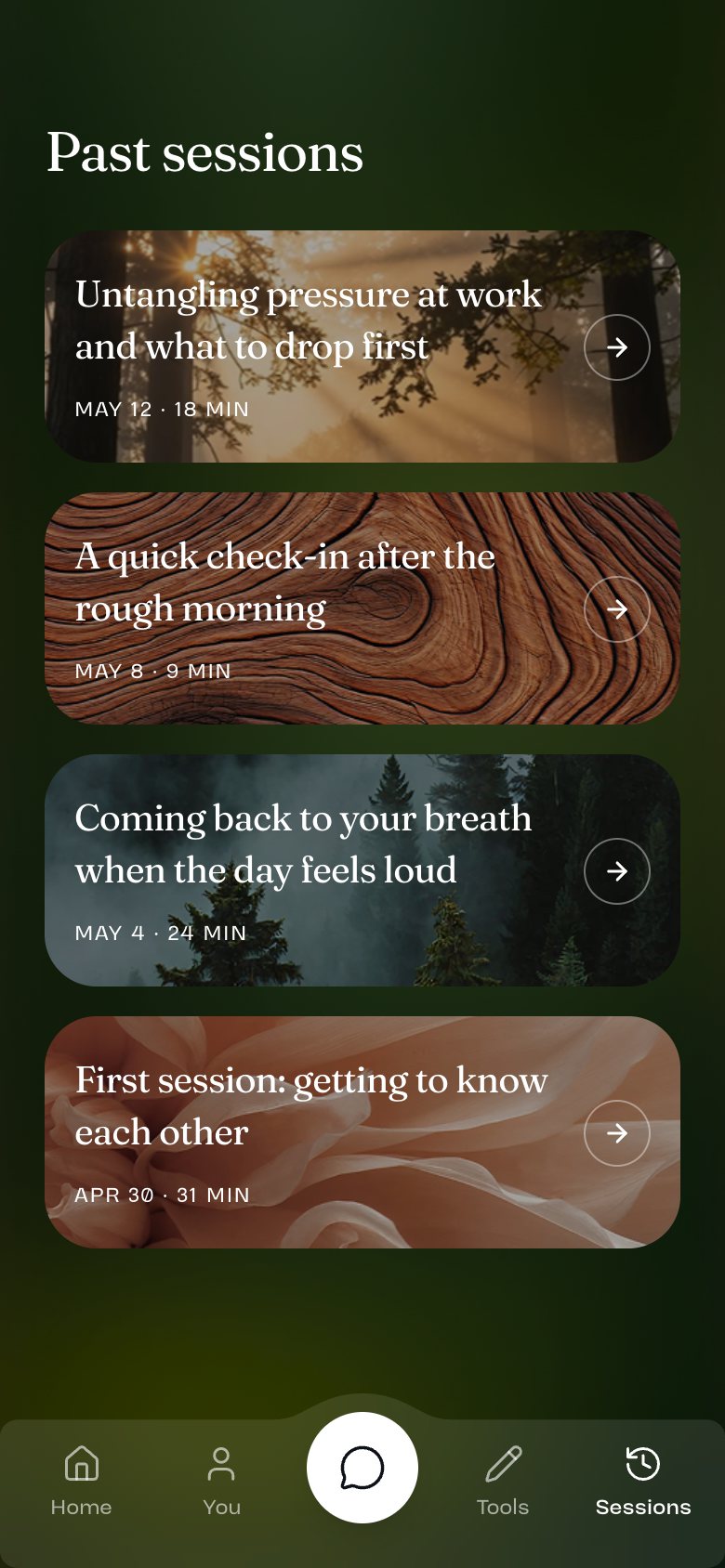
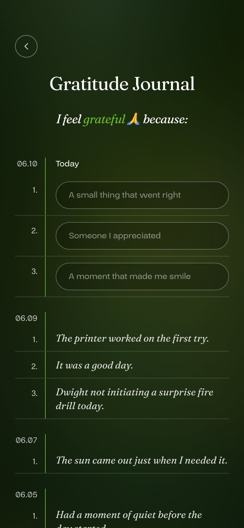
Insights: breakthroughs and beliefs Yuna has noticedAnxiety check-in history, with a trend chartPast sessionsGratitude journal
Progress: what Yuna has noticed, check-in trends, past sessions and a gratitude journal.

The A/B test

+59%more new Android users sent a first message (40% vs 25%)
+40%more new iOS users sent a first message (35% vs 25%)
+46%more new Android users started a session (40% vs 28%)
+22%more new iOS users started a session (38% vs 31%)

New users were split 50/50 between the old and new onboarding, and measured over their first 7 days. About 600 iOS and 120 Android users.

Still open

Too early to call retention.

People who got the redesign are coming back more often so far, but they have only had the app a short time. I'm treating it as a good sign, not a result.

We also found a tracking bug that made the old version look better than it was, and fixed it before reporting any numbers.